


Remember the scene in "School of Rock" where the histrionic Dewey Finn (Jack Black) teaches a class about musical genres using an intricate diagram scrawled on the blackboard, packed with connections between different styles and artists? Even if you've never seen the film, chances are you've stumbled across that sequence, in one form or another, during your wanderings online.
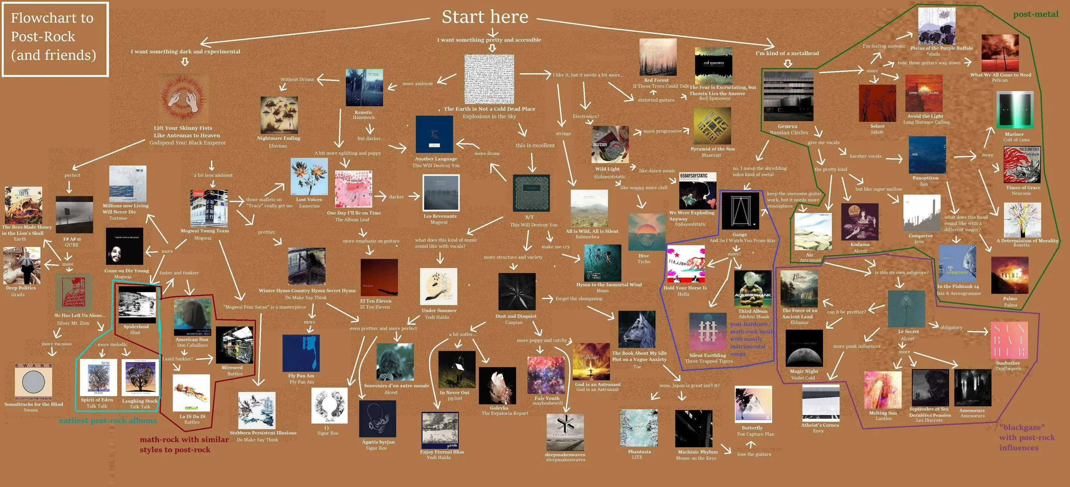
Well, the nerdiness of that map is nothing compared to the infographics that have been racking up likes on Instagram, Reddit, Pinterest and beyond in recent times. Pair the search terms "flowchart" or "beginners' guide"/"starters' guide" with the name of an artist or genre, and you'll be flooded with introductory diagrams linking album covers via annotated arrows. Often graphically rough around the edges (function takes priority over aesthetics here), these image-plus-text summaries offer an immediate, information-dense way into even the vastest and most complex sonic territories, with results that are both engaging and downright hypnotic, for diehard fans and newcomers alike.

Visual guides answer an increasingly pressing challenge: making the seemingly boundless feel approachable
Newcomers to the mapped-out field will find their way eased by the hierarchical layout of the featured albums, with the "essentials" easy to spot thanks to the sheer number of connections leading to them (beginners' guides, in particular, often include a "start here" marker suggesting which album to listen to first). Genre die-hards, on the other hand, will have fun measuring their own points of reference against those on the map, easily drawn into the inevitable game of "got it, got it, missing that one." They might conclude the chart is well made (and perhaps share it with fellow enthusiasts), or that it's a mess (in which case they might feel compelled to draw up their own version, given how easy these things clearly are to put together). Hopefully, either way, they'll have jotted down any unfamiliar titles and, having been dutifully entertained for a few minutes, will feel the urge to click straight through to more content of the same kind. Enthusiasts or skeptics, they'll have effectively joined the growing ranks of music-map devourers.
Whatever kind of user we're talking about, there's another reason these little diagrams are so captivating: the pull of exploration. Just as a geographic map lets its reader travel without moving an inch — picturing landscapes and possible routes — in much the same way, the arrows linking different albums and artists make it easier to plot out personal listening journeys. Sure, along largely pre-charted tracks — but that's exactly the strength of the format: by simplifying a landscape that's often perceived as prohibitively complex (to the point of seeming almost empty, paradoxically!), these nodes and arrows make musical orienteering accessible even to those who would otherwise be left out.
A good map works thanks to a balance between immediacy (and thus an intuitive approach, sharp reference points, clear signposting) and variety: whoever is studying it shouldn't feel "railroaded" down a fixed path, but should sense the freedom to choose which routes to dig into further. That's why the connections highlighted in many beginners' guides come with labels like "I like this, but it needs more distorted guitars," "more progressive," "more punk"...
Cartographers, pioneers, lone wolves: a small atlas for finding your way among the maps
Tracking down flowcharts and beginners' guides on the genres and artists you're into is dead easy. As mentioned, all it takes is a search engine. But if you don't have a specific destination in mind, and would rather just go wherever the moment's inspiration takes you, you could turn to pages that specialize precisely in putting out diagrams of this kind.

If at first the impact was mostly visual, over time the diagrams have grown richer with increasingly detailed commentary, while still keeping a branching structure that invites exploration rather than quick reference.
 Another key hub is /mu/, the music board of the imageboard 4chan, a temple of meme culture and an incubator of obsessions and taxonomies that later spread far and wide. Looking closely, cover-based infographics can generally be read as a direct offshoot of its rhizomatic approach, built on accumulation and endless offshoots. The wiki dedicated to the community collects dozens of visual guides devoted to artists and genres, including attempts to define the so-called "/mu/core" - the set of references considered central to the board's musical aesthetic. Besides the flowcharts, the page is also full of "essential charts": a more bare-bones format made of grids of covers with no explicit connections, sometimes organized by release year or subgenre. A form of visualization closer to a shared collection than to a real orientation map.
Every phenomenon, though, has its ancestors, and when it comes to music maps the essential reference point remains Ishkur's Guide to Electronic Music. Online since 1999 and relaunched in 2019 after a long period of inactivity, it's an interactive, sprawling map of the electronic music universe, enriched with audio samples that let you find your way among genres, subgenres, historic tracks and cult favorites. A project born of Internet 1.0, yet still hard to match today in scope and ambition.
These "centralized" projects have the great advantage of coherence and an overarching vision. At the same time, maps made by individual enthusiasts retain a value that's hard to replace. They offer a view from below, unmediated by any overarching critical framework, capable of delivering perspectives that are openly partial but, precisely for that reason, alive. In diagrams built by fans of specific genres, there's often room for records that a critical establishment obsessed with novelty and constantly chasing hype has left behind. What emerges is an alternative narrative, in which genres hastily written off as exhausted instead reveal ongoing creative and emotional continuity, made up of albums that are loved, discussed, passed down - sometimes even more meaningful, for those who actually live with them, than the universally acknowledged classics.
Between criticism, influencers and knee-jerk reactions, visual guides restore a sense of orientation that doesn't rely on verdicts
In a landscape saturated with quick opinions, knee-jerk reactions and figures who build authority more through sheer presence than through argument, these maps serve a curiously oblique function. Alongside traditional written criticism and the new dominant formats - from YouTube first reactions to TikTok's compressed style of explainer content - they offer a form of mediation with no guiding voice. Maps don't ask you to trust the author, nor to sign on to a verdict: instead, they offer a quick overview of a vast landscape, and in doing so awaken curiosity and the urge to wander.
Representations of this kind, in short, don't function as rankings or verdicts. They serve instead to keep the possibility of movement open, to suggest that every listen could be the start of something else. They don't tell you what's worthwhile, but what leads somewhere - and that's exactly why they draw us in so irresistibly, arrow after arrow.
Add OndaRock to your favorite sources on Google Discover. Don't miss our reviews, milestones and latest news straight in your feed.
This article is an English translation of the original Italian text by Marco Sgrignoli, published on OndaRock.it. It was translated with the help of artificial intelligence, under the editorial responsibility of OndaRock's editor-in-chief, Claudio Fabretti.


